Content design for dating app investigation

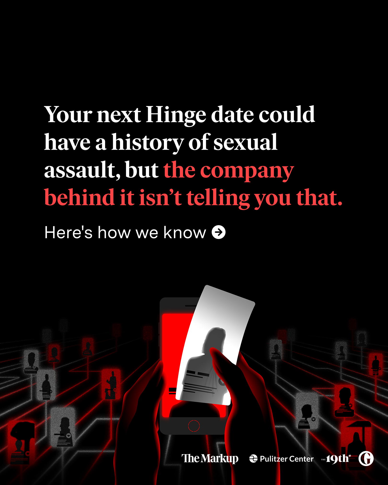
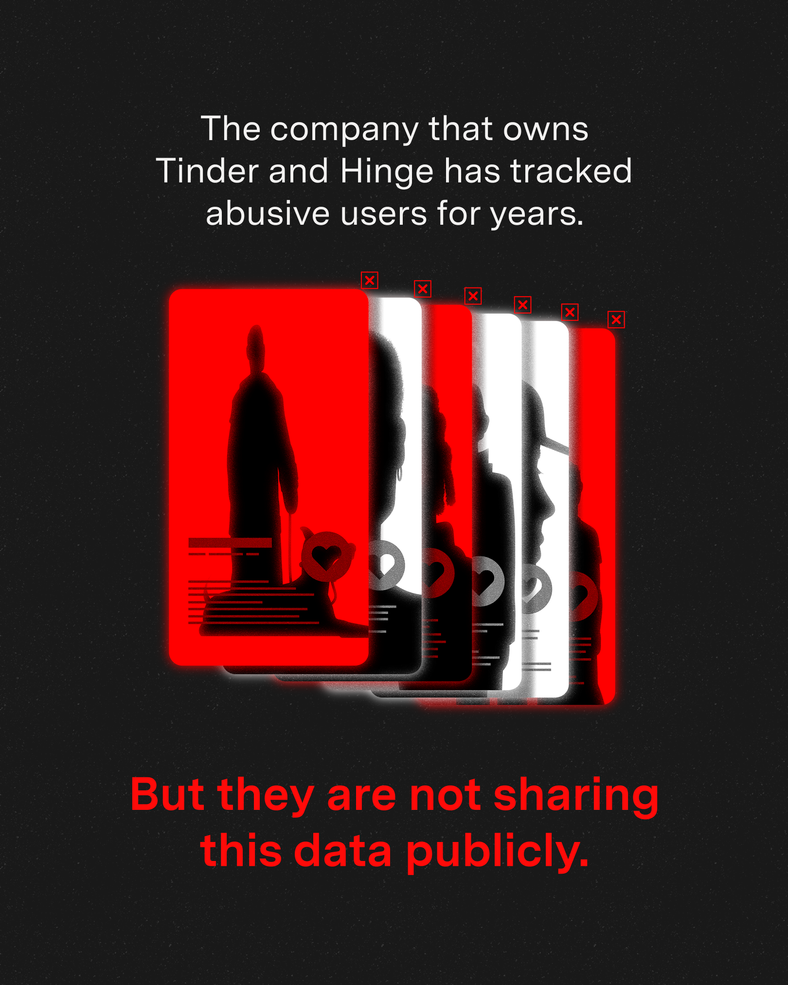
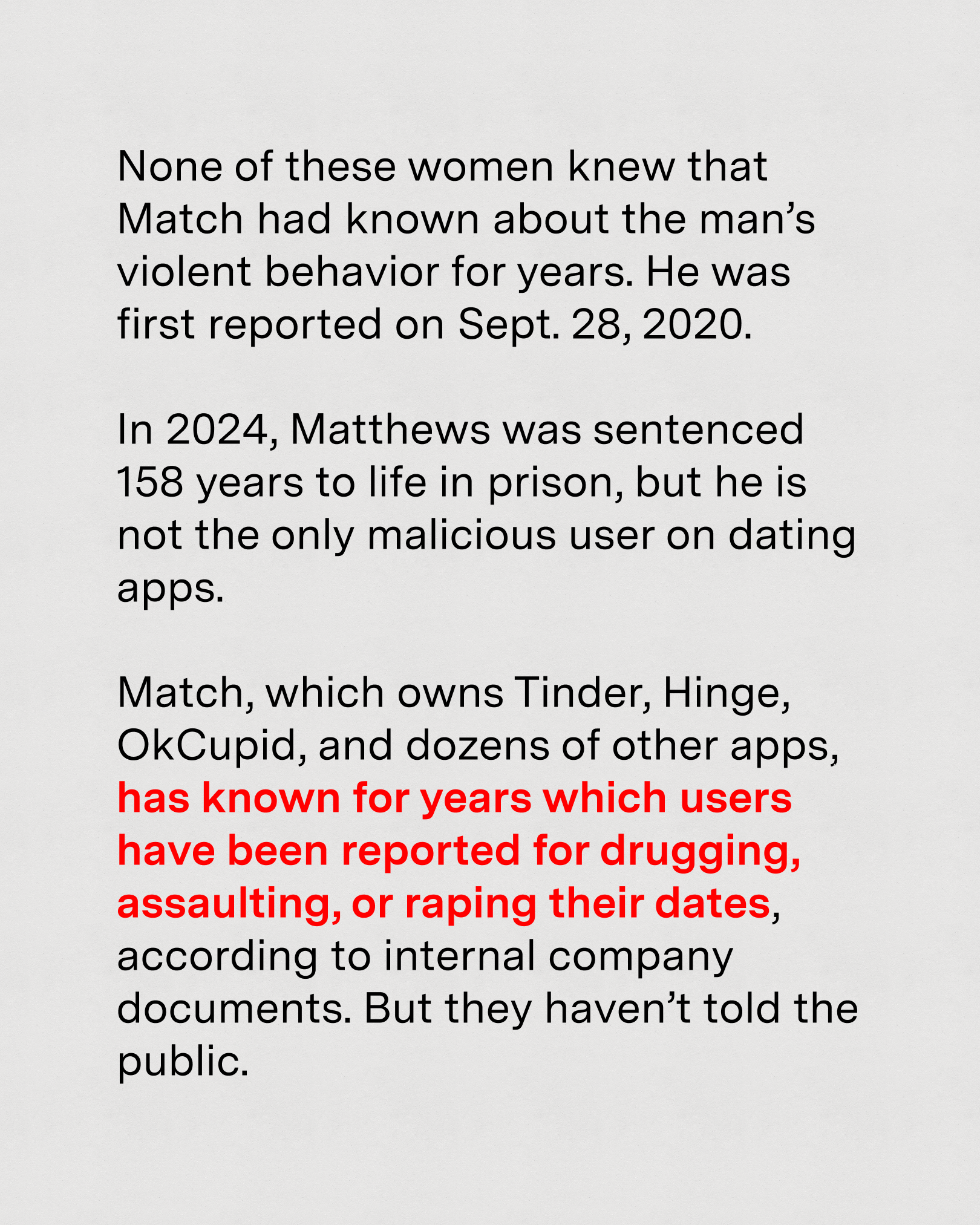
The 6,000-word story is an investigation into how Tinder and Hinge’s parent company, Match Group, has kept a record of bad actors on its app for years, yet still failed to reveal key information to its users.
Using that as a foundation, I created 4 sets of social assets focusing on different aspects of the story.
Impact: So far, the posts have reached over 400K audiences on IG and have over 25K engagements. It’s the best performing post on social in the organization’s history.
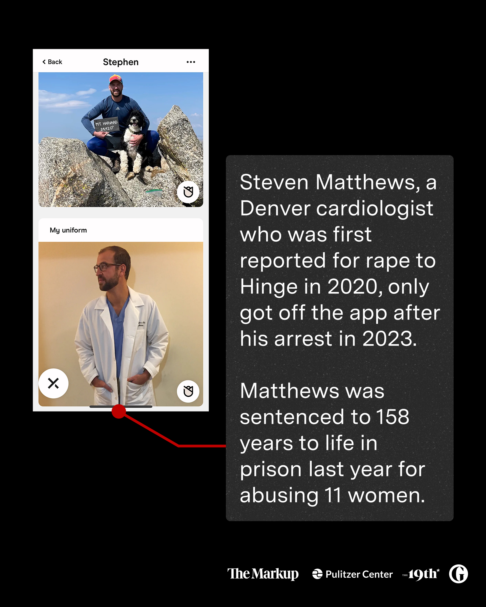
Post 1: Timeline of the main case
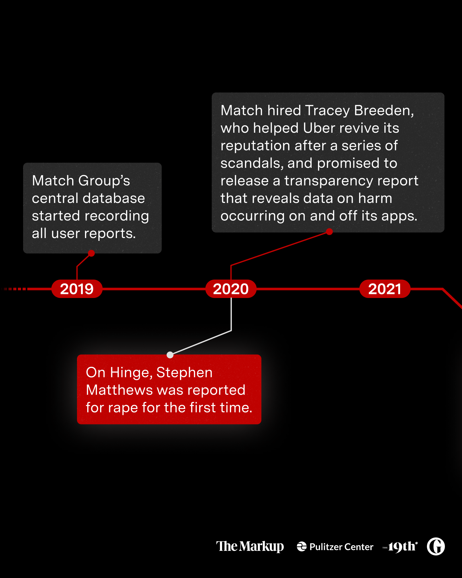
The reporters compared a real harassment case — from in-app reports to conviction — with Match’s efforts to protect its reputation. I extracted key time stamps and put them side by side for to highlight the story visually for its launch. Things in my mind while writing and designing:
Address the readers directly to resonate with them, as this is an issue faced by many
Lead the cards with the Steven Matthews cas,e as it’s really enticing
Use red to showcase the case timeline to add a sense of seriousness, then grey for Match’s actions to create contrast
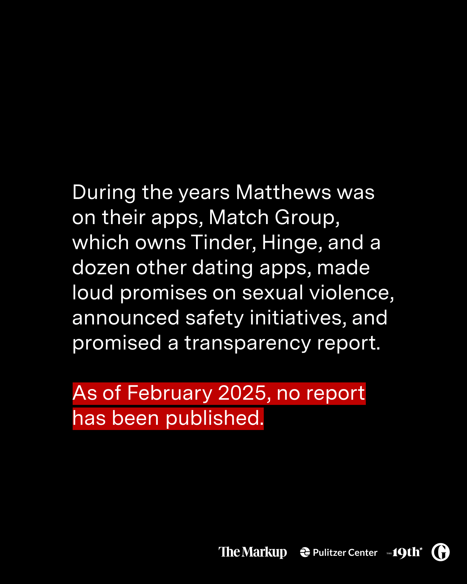
Mention the tests around banned accounts (slide 6) to highlight Match’s failure in preventing bad actor from rejoining the app (on top of failing to disclose critical info that helps keep their users safe)
Impact: The post was accepted as a collaboration post by The Guardian and the Pulitzer Center. As of March 5, it has got over 24K engagements (14K likes, 152 comments, and 8K shares).
Note: if you are in Canada, you might not be able to see the post on Instagram due to policy changes.


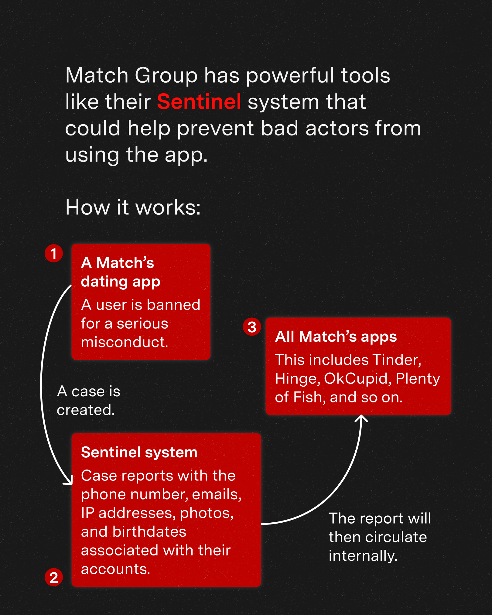
Post 2: The company’s failing report system
One of the story’s major takeaways is how Match has a cross-platform, central database for the harassment reports, but chose not to disclose this information despite years of criticism. I simplified the language and visualized the company’s process to deal with the reports. My thoughts:
Emphasize the info gap between Match and its users
Instead of paragraphs, visualize the process with steps (I referenced different process maps)
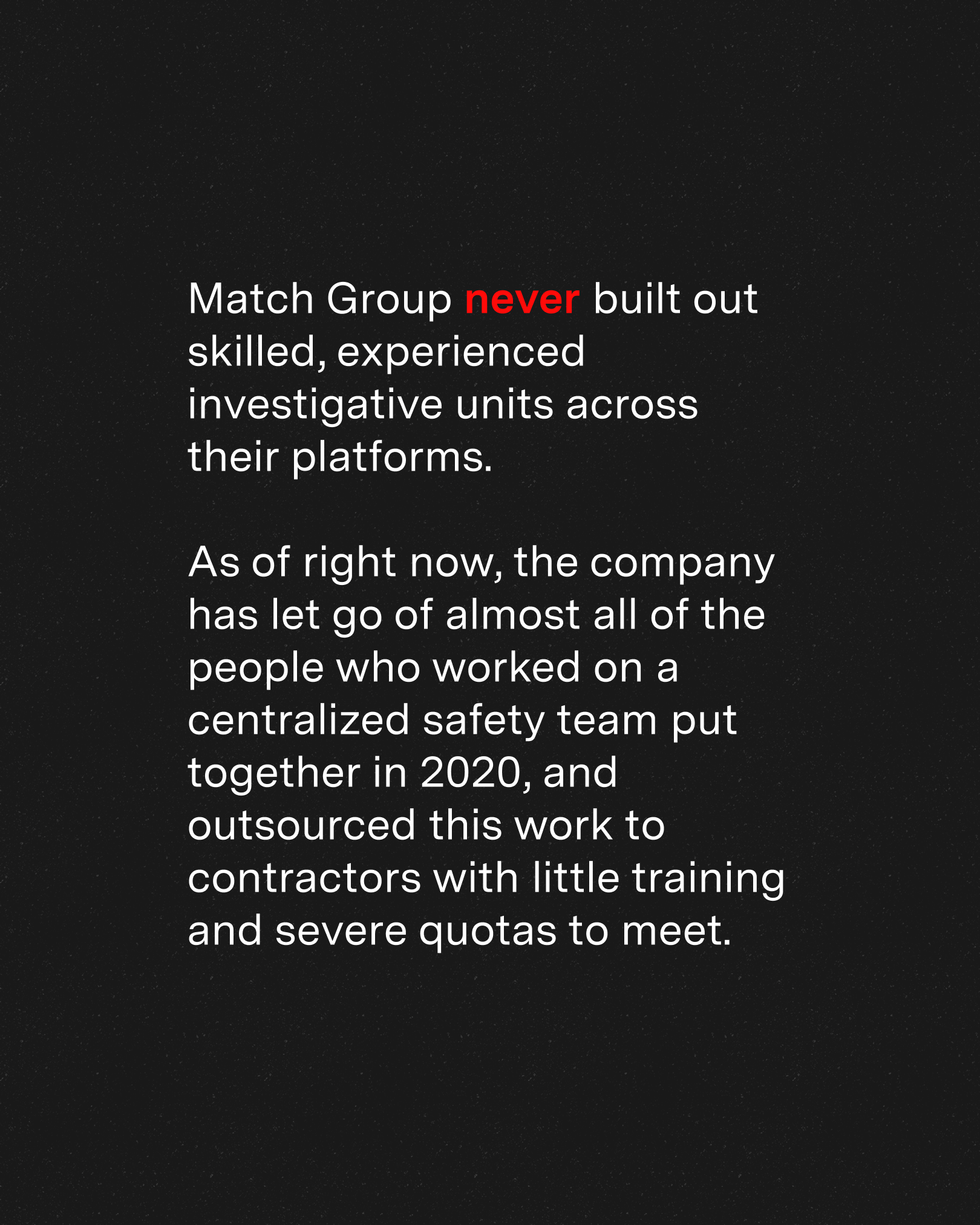
Highlight why the system is failing (lack of resources and effort) and connect it to its recent layoffs

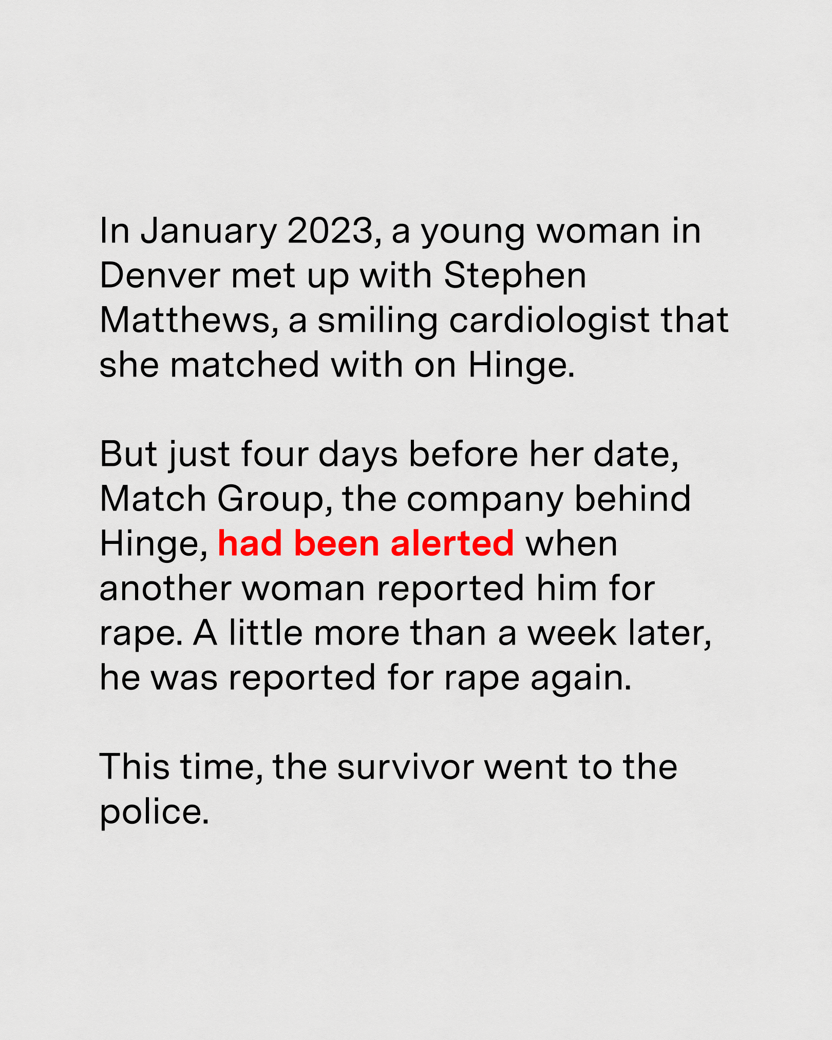
Post 3: The case of Steven Matthews
I want to go back to the case as it’s really enticing and would definitely make people want to read more. I focused on the story and emphasized how all the assaults could’ve been prevented. Then, in the caption, I led the reader to the full story to find out more about how this has happened.

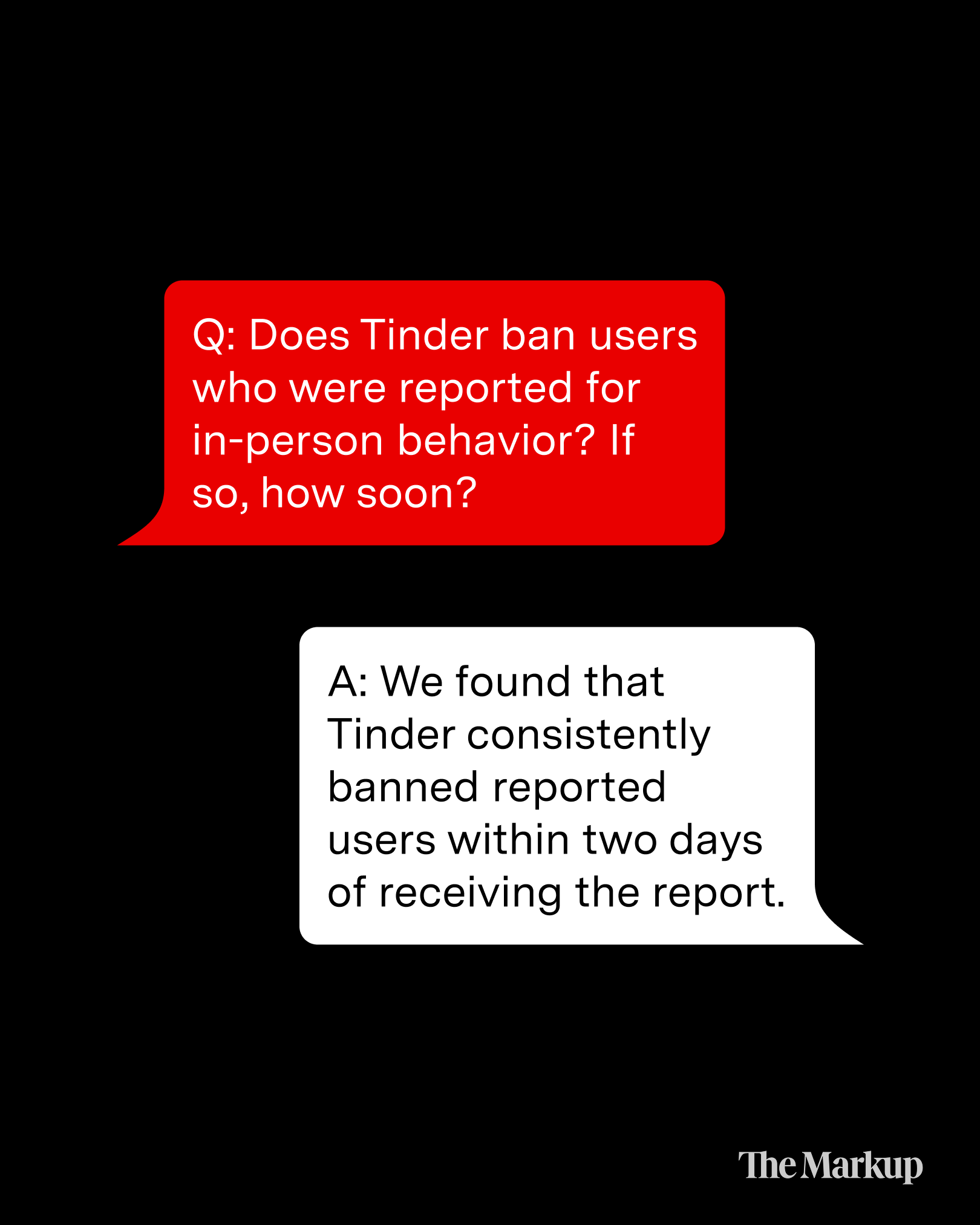
Post 4: Investigative tests & results
Another major finding of the story is how the reporter experimented with the banning process on Tinder and found it’s relatively easy to open a new account on the platform. Rather than using paragraphs of text, I used dialogue bubbles to stimulate some of the questions asked by users/readers. This could help with readability and also make each slide shareable on its own. The posts are designed but yet to be scheduled.


Other Projects Like This

Art, Community, and Boston Chinatown
A documentary about community artists in Boston who use art to uplift the Chinatown community voices.

Growth Redesign
Landing pages designed for an end-to-end subscriber experience to boost engagement and conversion.