Subscriber Experience Design
How can we encourage users to subscribe to our data service?
The product boosted the paid subscription rate by 28% and revenue by $30,000
Designed high-fidelity prototype and coordinated with a developer to deliver end-to-end subscriber experiences
Led content strategy, ensuring the right activities are prioritized to uncover users’ content needs
Goals
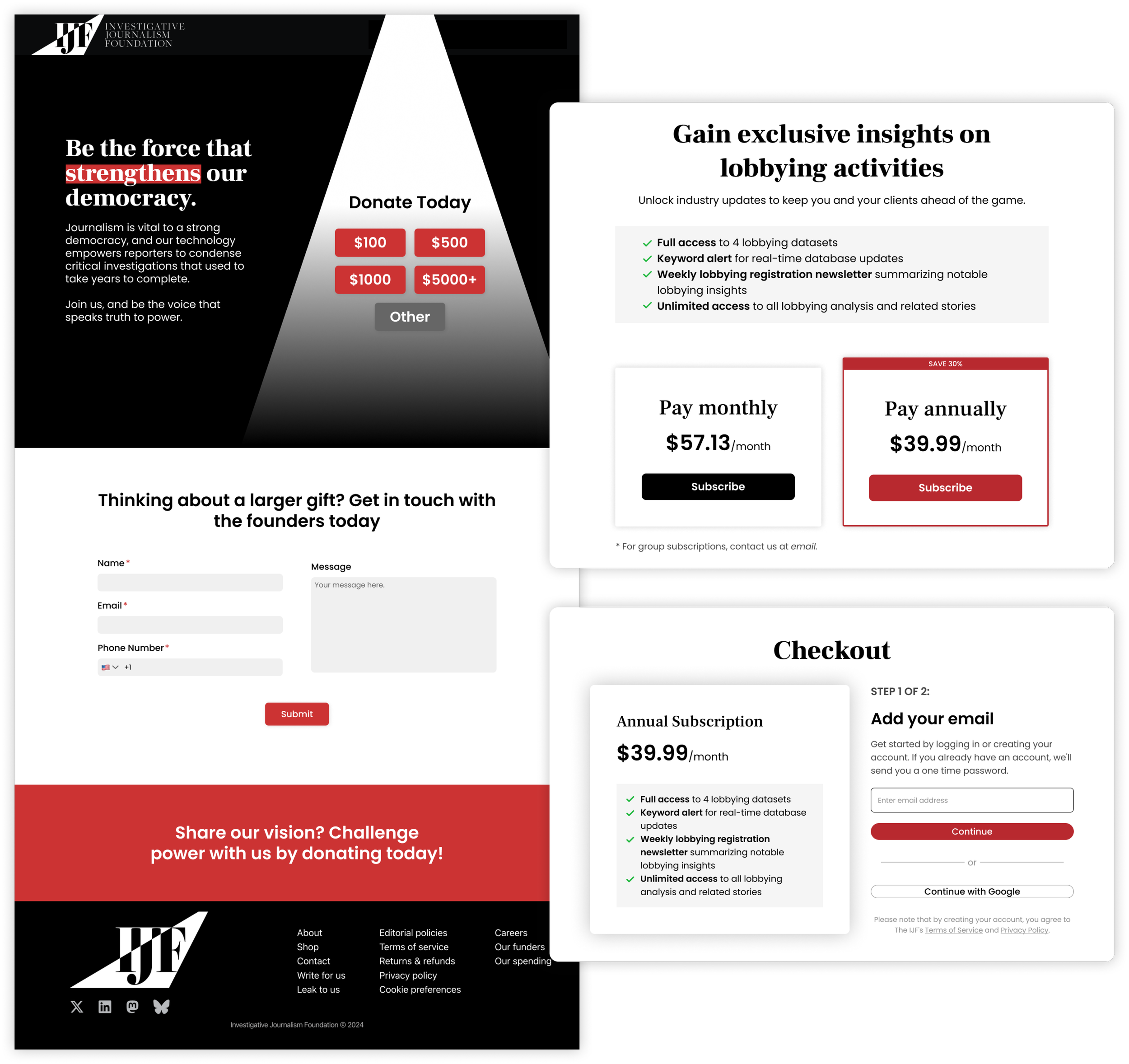
The business goal for this project is to increase revenue from database subscriptions and position it as a primary revenue stream.
With that in mind, I mapped out the design goal: to create a clear, value-focused subscription experience using intuitive language and layout.
Who are the users?
One of the challenge I faced was ambiguitiy in user needs and profile. To better understand who I’m talking to, I mapped out the current paid and unpaid subscribers, then chose the one with the most potential: lobbyists.
I chatted with around 10 lobbyists, digging into their daily routines, motivations, and pain points when accessing policy information

With this group of audience, they care most about bringing valuable insights to their clients. Therefore, the content for this page focused on:
Showing the benefits (such as saving research time and real-time alerts) by subscribing to the dataset
Establishing credibility of the datasets
Allowing room for users to test those testimonies made in the page themselves
I also conducted conpetitor analysis to see what’s the gap between successful data products and our product.

The Pitch
Building on the research insights and past data, I pitched creating pages that:


Lesson Learned
It’s essential to identify user intent in both content and UI design, and then you can demonstrate product value based on users' needs stemming from that intent.
Less IS more. Making things as simple as possible for users is a direct way to boost engagement.
Testing is key. A major challenge of this project was the lack of prior examples or data points, and the product’s uniqueness made it difficult to determine focus areas quickly. If I were to make an iteration, I would use the current template to gather more user insights.
Other Projects Like This

Free City
An app that helps you find the latest discounted cultural activities in Toronto.

Nook
An app that finds you the best place to work and the best people to work with.