Nook
Looking for the best place to WFT in town?
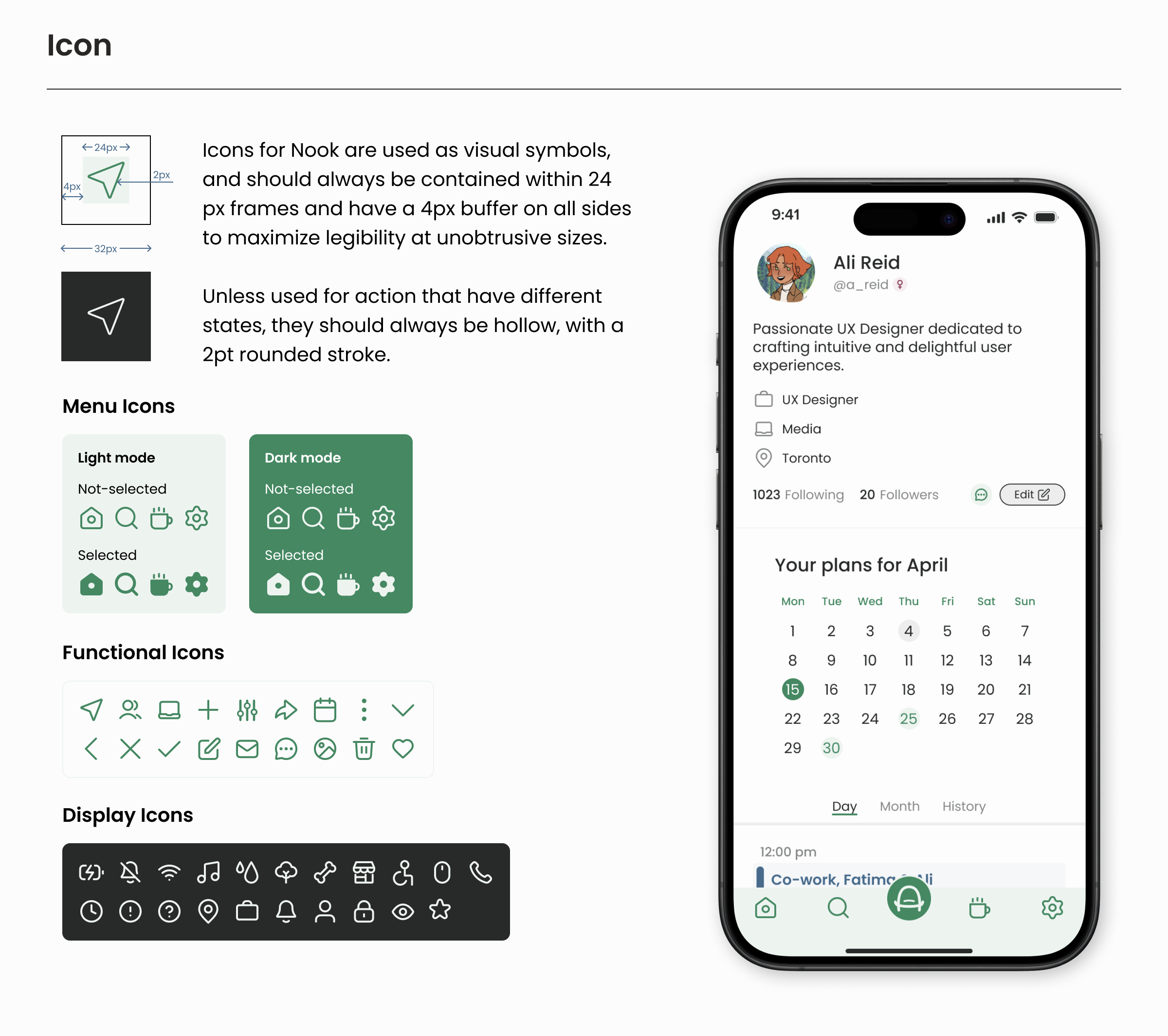
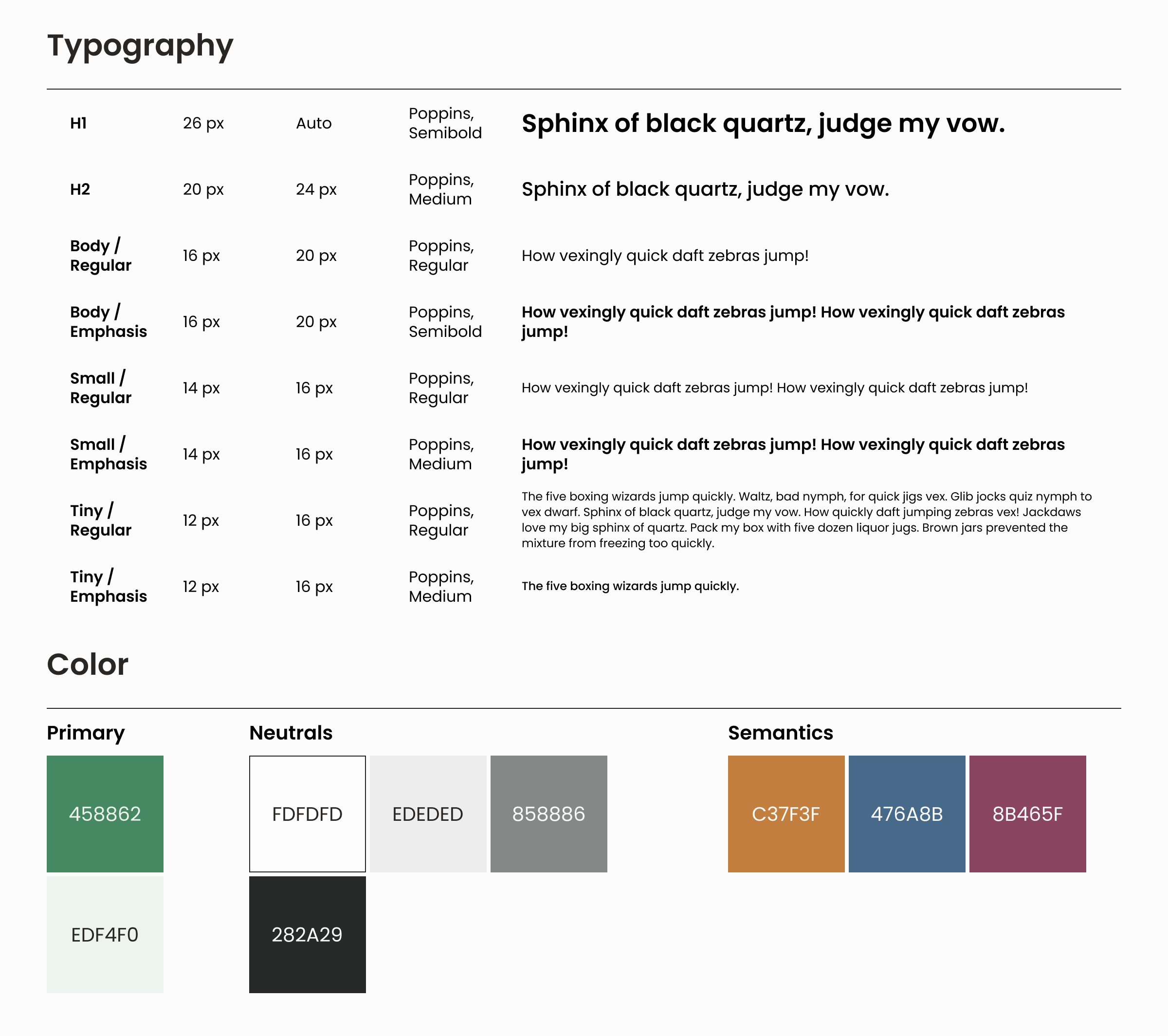
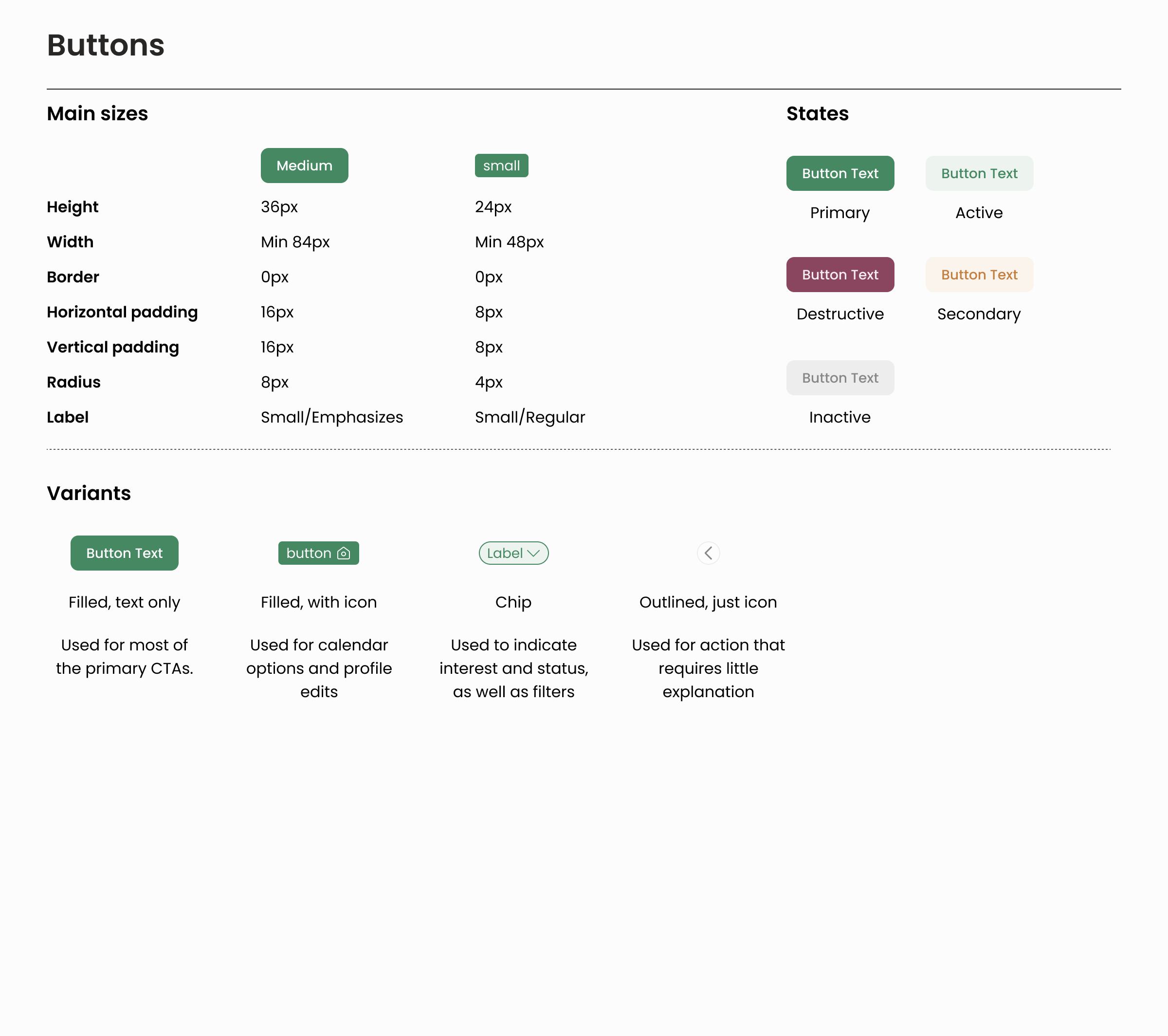
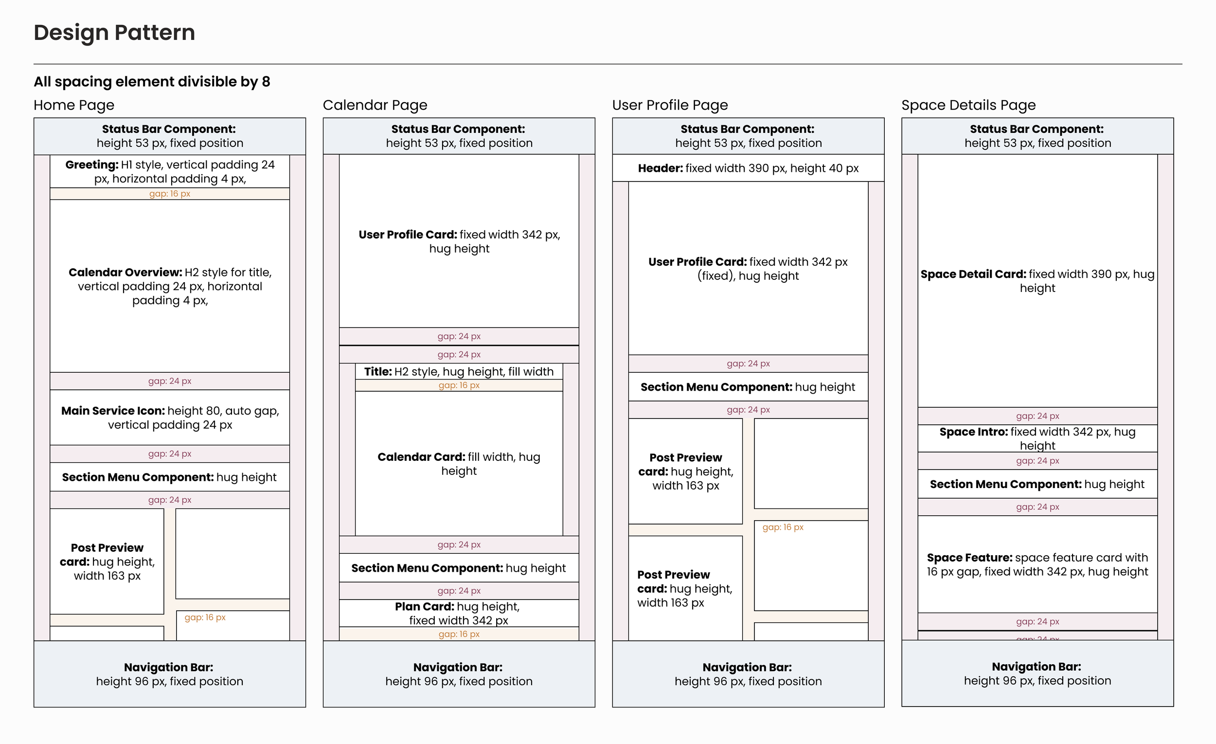
Created a design system using Figma’s variants and tokens, allowing smooth transitions between dark mode and tablet mode
Designed a high-fidelity prototype with animations to demonstrate key user task flows
Developed a cohesive color palette and designed logos aligned with the overall design concept
Conducted market research to inform design decisions that match user needs and industry trends
Sector
Location Finding
Timeline
March 2024 to April 2024
System
IOS, mobile
Tools
Figma, Procreate
Design Pitch
Nook is an app that helps users find city workspaces tailored to their needs, connect with work partners, and share recommendations by adding or rating spots.
Unlike mainstream apps, Nook focuses on locations ideal for remote work and fosters professional connections, catering primarily to digital nomads and remote workers seeking in-person networking opportunities.
Market & Competitor Research
Remote or hybrid work continues to be a growing trend among companies. Statistics Canada notes that in 2023, 20.1% of Canadian workers were working from home, a stark contrast to the 7.1% reported in 2016.
While remote work is popular, it has challenges, including reduced interpersonal connections, difficulty reaching colleagues, and limited home workspace. Many workers opt for community spots like coffee shops, with 40% of Toronto workers willing to pay for this.
The current competitors, specifically Yalp, Bumble Bizz, and Blind, aim to create a more tailored experience by focusing on accessibility, relevance, and community-building. Meanwhile, Yalp stands out for its focus on UGC and integrating multiple services, and Bumble Bizz differentiates itself with features designed for safety and professional connections, such as the "Women Only" networking option and language preferences, which enhance inclusivity.
Pain points and opportunities
Unreliable access to amenities (WiFi, restrooms and charging plugs) and limited dine-in time in public venues like coffee shops
Desire for casual interactions in a WFH office setting and networking beyond colleagues
Interest in exploring new city spots while working
Need for study partners to boost productivity
Design Critique
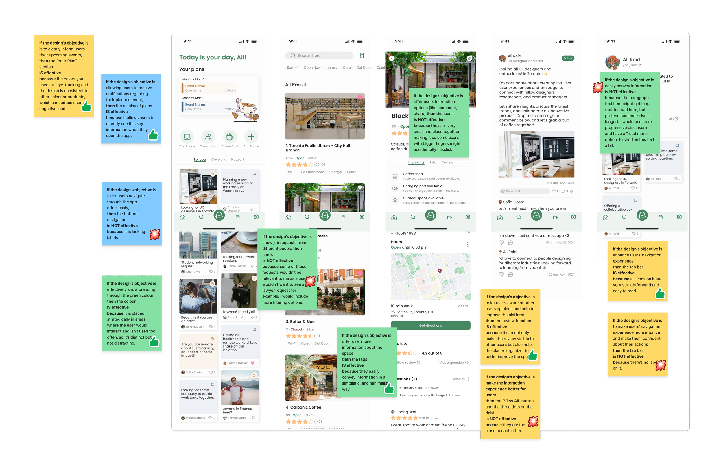
After building an initial high-fidelity draft, the prototype was taken to a group of designers during a critique session.
Issue 1: Some networking requests might be from industries that users are not interested in.
Solution: Include more filtering options to personalize user flow.
Issue 2: Bottom navigation lacks labels, making navigation less intuitive.
Solution: Added selected status for all menu items to improve clarity.
Issue 3: Long paragraph text can overwhelm users and hinder effective information conveyance.
Solution: Introduced a "read more" button for progressive disclosure, allowing users to expand longer posts as needed.
"The best part about WFH is that you get to call anywhere your office."
Establishing User Interface

Clickable Prototype
The high-fidelity prototype allows users to complete three tasks:
1. Find a place to work alone or with someone
Users can search for a space by clicking “Find Space” on the home screen or tapping the “Search” icon in the menu.
If they want someone to co-work with, they can look through the “Co-work” tab on the home page or tap the “Coffee” icon to find a session.
2. Schedule a coffee chat
Users can either post to initiate a coffee chat or go to someone’s coffee chat post to chat about the details.
3. Write a space review
After visiting a space, users can add a review on the space’s details screen to let others know what they think of it.
The prototype can be adapted to a dark mode or a tablet. Users can switch to the dark mode through “Settings” or view a tablet prototype via this link.
(The clickable prototype shown is also available in Figma)
Lesson Learned
Although creating animation and interaction is fun, a UX designer’s job is not always to make the best UI. Rather, it’s to show the task flow that best mirrors users’ happy path. I really enjoyed working on the animations and developing design systems for this project, but there's still room for improvement in how the task flow is presented.
There is no such thing as a "perfect starter" for a design system. The best a UX designer can do is build a solid foundation and ensure plenty of flexibility for future iterations (and really, just start doing it).
Other Projects Like This
Free City
An app that helps you find the latest discounted cultural activities in Toronto.
Growth Redesign
Landing pages designed for an end-to-end subscriber experience to boost engagement and conversion.

